JP MORGAN CHASE
Chase Mobile checkout (Redesign)
Problem
Chase’s point-of-sale was severely outdated and abandonded. It also required a much-needed accessibility update.
Solution
A full redesign and research effort with accessibility in mind, end-to-end.
Situation
A request to update certain sections of Chase Mobile Checkout (CMC) to make it ADA-compliant uncovered the possibility to redesign the entire application.
CMC had not been updated for 8 years.
I led a team of 2 other designers and worked closely with a user research lead on redesigning the end-to-end user experience for merchants and customers transacting with CMC —all while accounting for accessibility compliance.
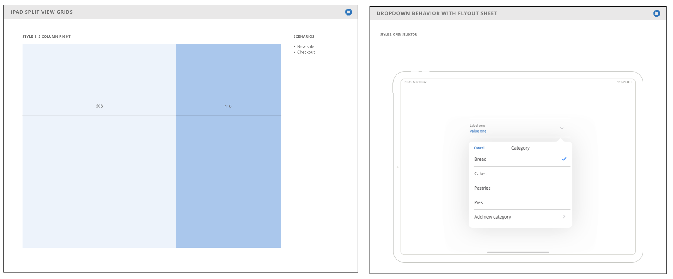
Updating the mobile phone experience with established Chase design standards also gave us the opportunity to contribute to Chase’s pattern library with new Chase components for tablets.

Comparison between the app’s out-of-date design and the latest Chase mobile banking app at the time.
ACTIONS
We interviewed current CMC users at their businesses to uncover pain-points and redesign opportunities.
We heard users would like to see:
A better user interface.
An option to customize the “home” view.
Remove the awkwardness of the tipping step in the checkout flow.
Inter-device connectivity between phones & tablets at the same business.

We then got together as a team, where I co-led empathy mapping and affinity diagram exercises (something I had not done since I publishing the article on "Paper-in-Screen Prototyping” on Interactions Magazine).
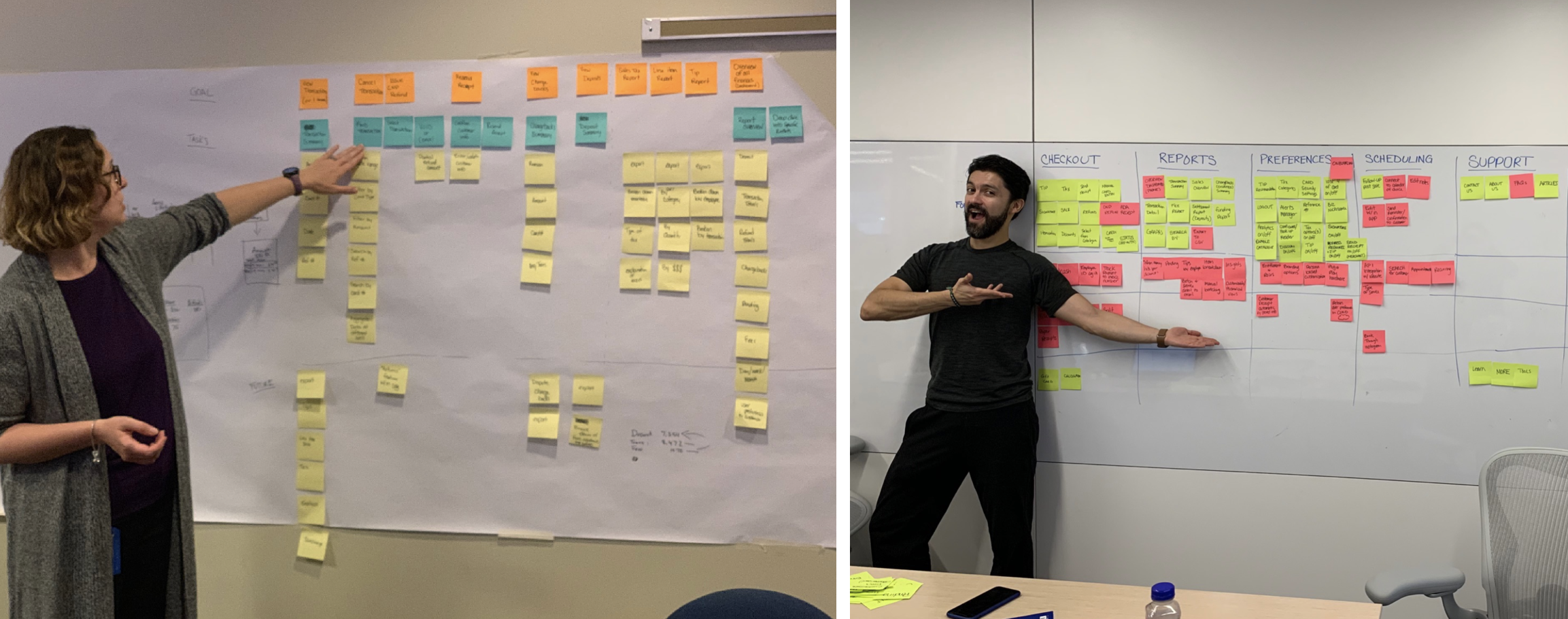
Once we defined what the new information architecture was going to be for the new version of CMC, we proceeded with a very interesting prototyping technique: rapid sketch prototyping.
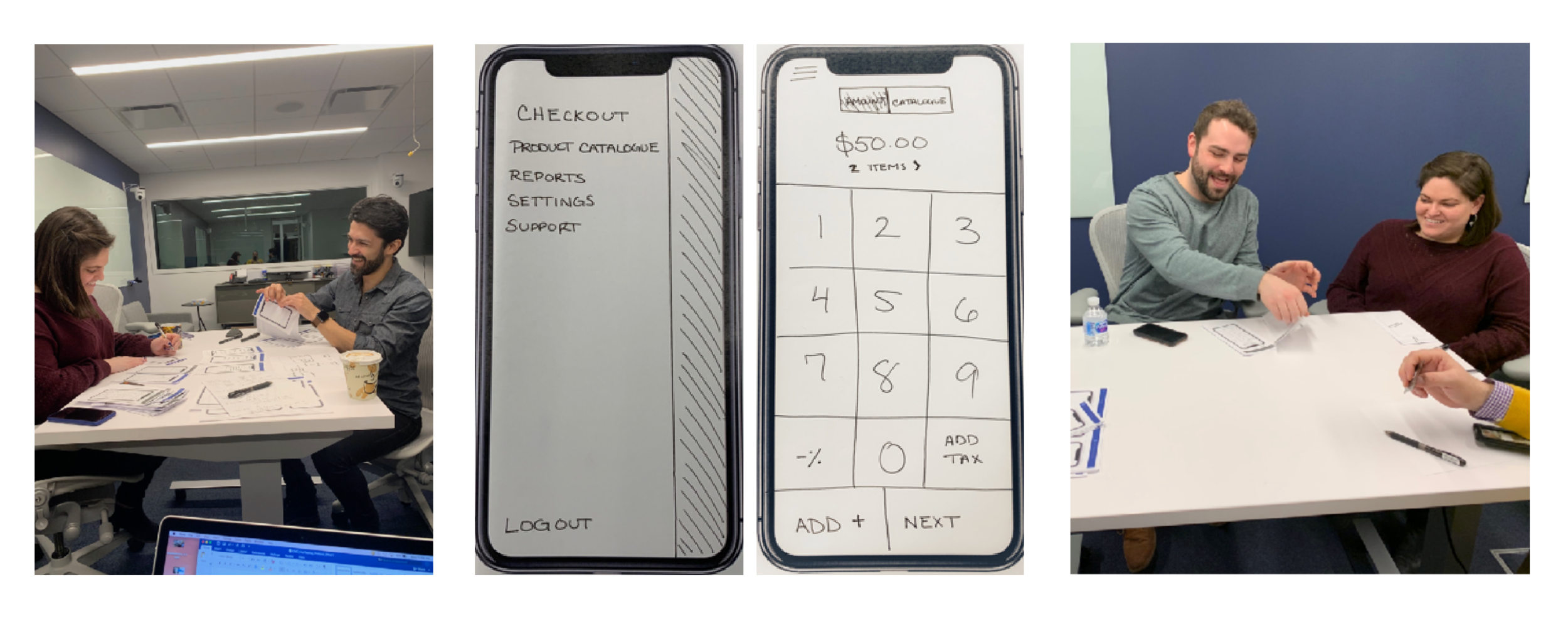
We asked users we had previously interviewed to come back to our research lab for a follow-up study.
My team and I sketched different flows on phone frames and acted as “computers” while users went through the new checkout flows.
Whenever a user couldn’t proceed, we paused the exercise. I then would sketch alternative solutions based on that user’s feedback. If solved, I would include the new sketch in the flow and unpause the exercise.
This led to gathering new insights and iterating on our designs in a quick and efficient manner.
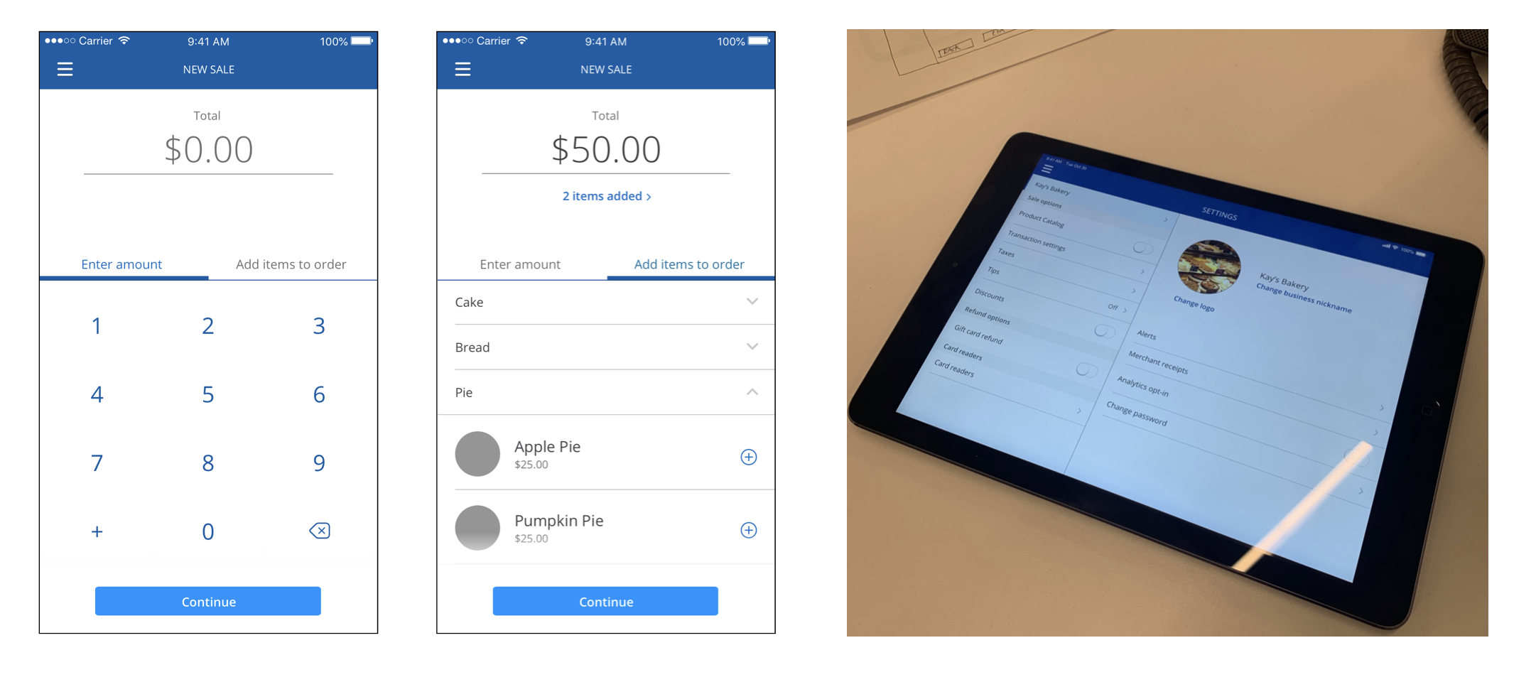
Wireframes and accessibility
Users were invited back for further testing using low and high fidelity wireframes we designed based on information gathered during the rapid sketch prototyping exercise.
The prototypes used during testing included patterns and components from the current Chase design pattern library for mobile.
We used this opportunity to design and include new patterns and components for tablet (based on current Chase design standards).

After a few more rounds of testing, we moved on to high-fidelity prototyping. In this case, we were able to leverage some existing Chase design patterns, which in turn allowed for our designs to more closely match the current Chase personal and business banking mobile apps.
Our designs were put to the test by evaluating them while we used visual impairment simulation glasses. We also took a fully coded version of out app to an accessibility conference to test with real visually-impaired users.

However, our efforts didn’t stop there. Because this app is predominantly used on an iPad, we leveraged current Chase design standards to create a brand new style guide for iPad versions of any Chase app. This is something that didn’t exist before, so we were pleased to be able to share the new style guide with other design teams internally.
RESULTS
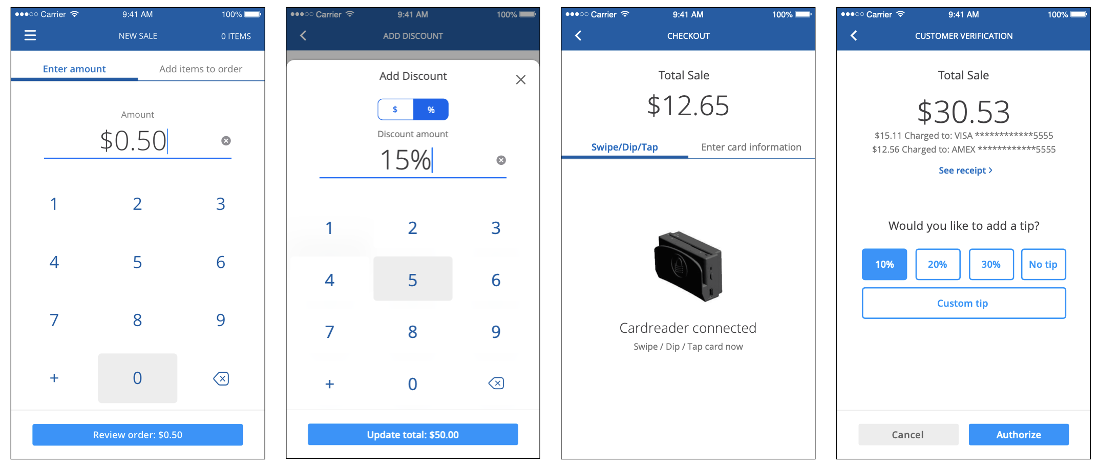
These are the final designs, for mobile phone & tablet. I was responsible for the layout, as well as the graphical assets delivered to engineering.

One of the biggest wins int his project is how we were able to improve various aspects of the checkout flow —in particular: the tipping step.
When the merchant handed the device to the customer to complete the transaction, it was during the tipping step, which led to an awkward interaction. We redesigned the flow so that this would’t be what the customer sees upon using the phone or tablet.
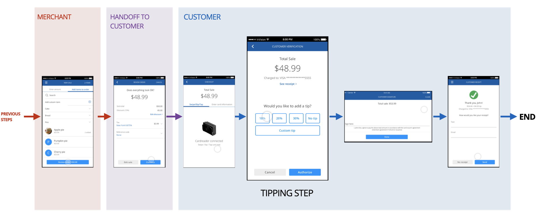
Here’s a prototype of the final design:

conclusions
Leadership for Chase Small & Medium Business welcomed the results of the research studies and approved the redesign of CMC.
We achieved a successful and rapid redesign for an app that had not been updated in many years.
ADA specs were included in our final delivery.
We contributed to the Chase design pattern library by adding new tablet style guides for other designers at JPMC to use.
Here’s a comparison of how the app looked at the end of the project vs. when it started.

PayPal + Chase pay
A partnership was announced between PayPal and Chase. This is a project in which I was the design lead for the Chase-side.
This partnership allows PayPal users to add Chase Pay as a form of payment inside the PayPal wallet, among other things.
Here's a short blog post I wrote about the project.
What would a chase mobile payment solution look like?

I joined JP Morgan Chase to help them figure out an answer to this question.
I started my role as a Lead UX Designer in support of Chase Pay: a mobile app (and eCommerce) digital wallet directly tied to the customer’s Chase credit and debit cards.
There are already many mobile payment solutions available: Apple Pay, PayPal, Google Pay... etc. However, none come from the place where people trust their money to be kept: their bank.
This is where Chase Pay came in.
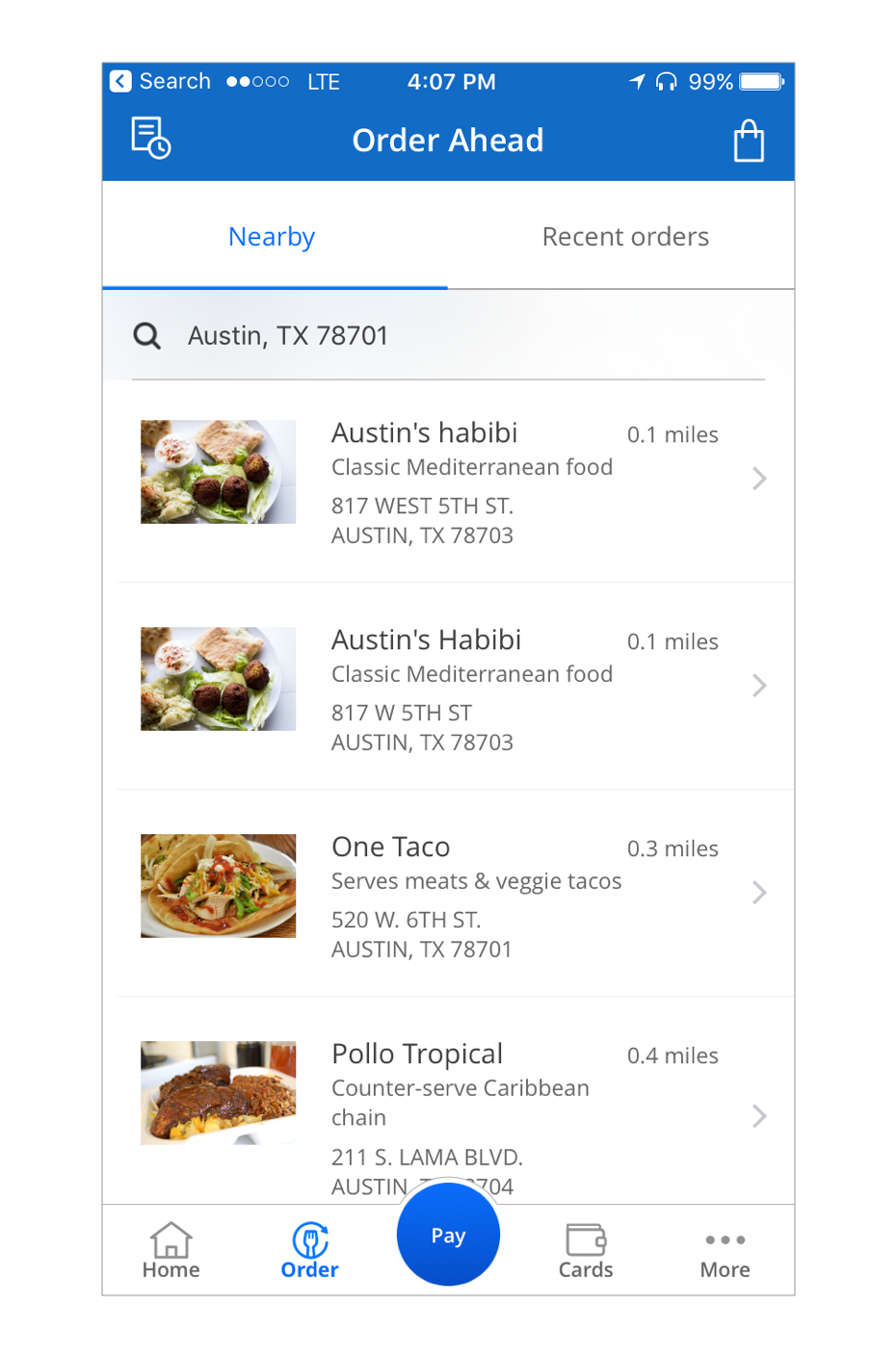
Chase Pay offered the ability to pay using Ultimate Rewards points; exclusive promotions from Chase and other merchants; and the ability to order ahead from hundreds of restaurants.
building the very first version of chase pay (ios)
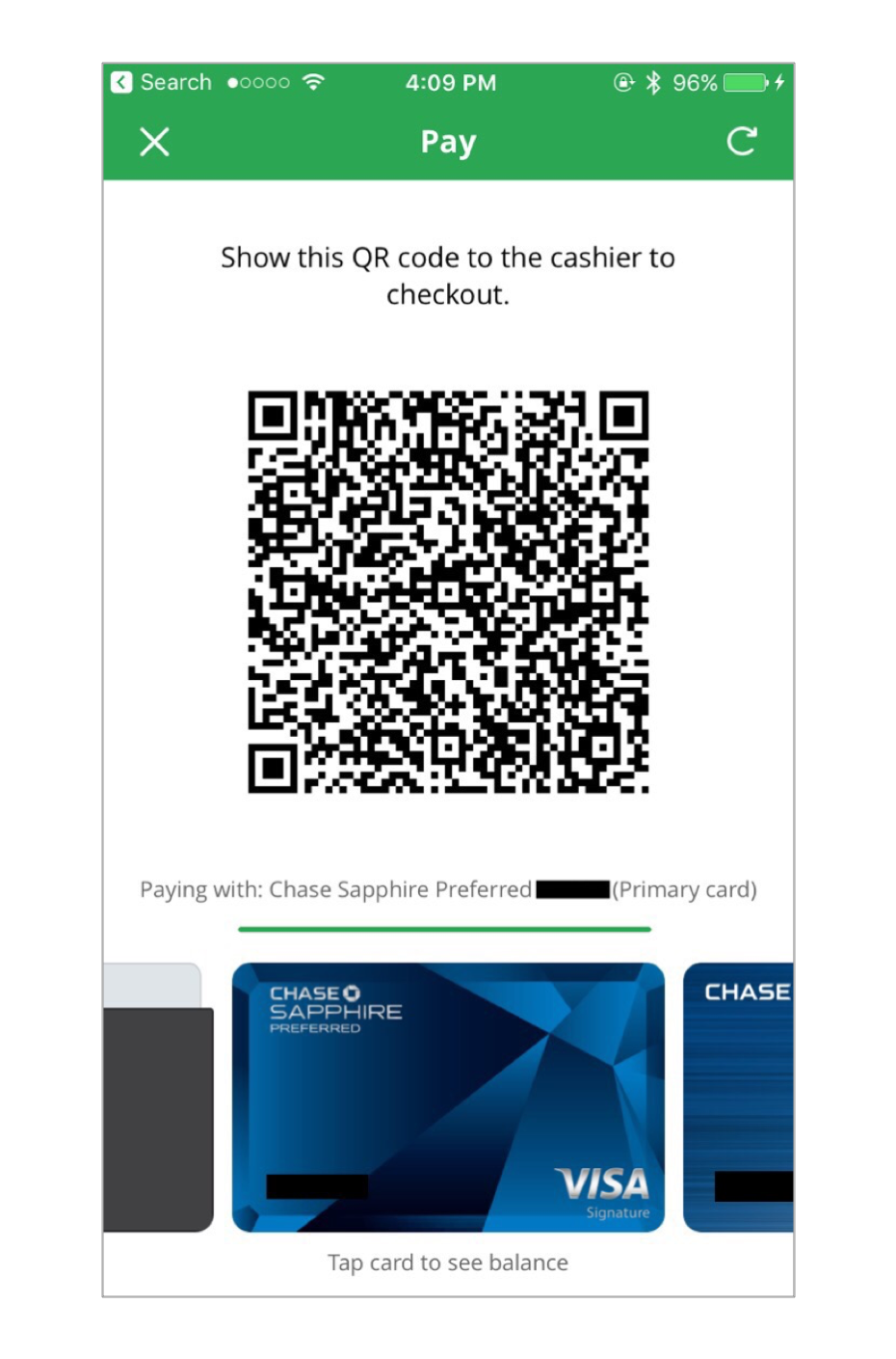
We needed to build a mobile payment solution based primarily on (but not limited to) QR Code technology for "point-of-sale" interactions.
Since we didn’t have access to the iPhone's NFC capabilities, we needed to find a way to make the extra time it takes to pay with a QR Code as simple and rewarding as possible for Chase Pay users.
Tasks: leading the desgin of the "pay" experience
It was my responsibility as a lead designer to assist product designers with ideation and direction from a research, visual and interaction design perspective.
Actions: ideate. mock up. prototype. test. repeat.

I explored various versions of the pay experience with the team by following a typical design thinking methodology.
I began by defining the overall information architecture of the application with a special focus on iOS (without loosing sight of the Android experience for a future implementation).
I prefer to take a hands-on approach to leading and mentoring. I engaged with product designers by sketching various pay screen solutions on paper as well as creating low and high-fidelity mockups alongside with them. We followed by meeting regularly and sharing our solutions in bi-weekly design critique sessions I helped facilitate.
Result: a hero action for the pay experience
Various solutions were created by the team, but after I worked through some tweaks with the rest of the designers and helped conduct a few research rounds, the first version of the pay view was created. This is the version that made it to the "soft launch" release.
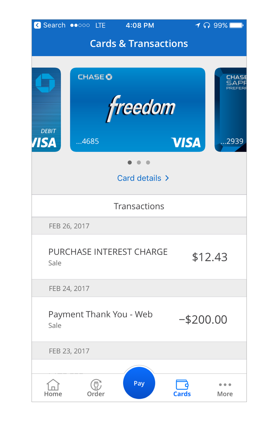
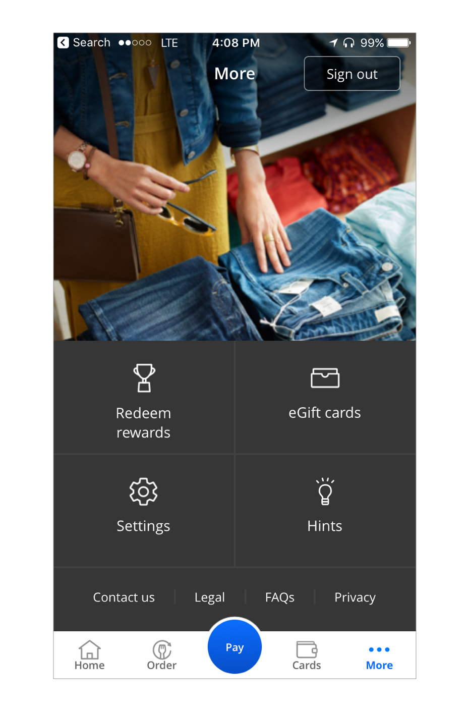
I didn't just focus on the pay view. I also worked directly with the rest of the team on the what resulted in the main navigation for the app. You can see a few examples of it in the images above.
The final version of the app eventually live on the Apple AppStore and Google Play Store.
Shortly after it’s release, Chase agreed to join Bank of America, Citibank and Wells Fargo in creating Zelle for personal digital payments. This solved the main problem ChasePay was trying to get at, which meant the end of the offering altogether.